Delving into Cape Town’s Art Deco heritage
21 January 2021 | Story Farah Khalfe. Voice Neliswa Sosibo. Read time 9 min.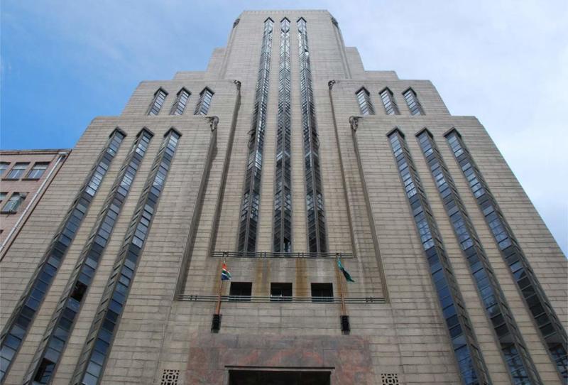
On Thursday, 14 January, Summer School attendees were treated to an insightful lecture on Cape Town’s Art Deco heritage, presented by Dr André van Graan – a heritage architect and the former head of architectural technology and interior design at the Cape Peninsula University of Technology.
Dr Van Graan’s particular interest lies within the development of architecture in the 20th century, specifically Art Deco architecture, and his PhD thesis explored the way architecture developed around Cape Town from 1918 to 1948.
What is Art Deco?
But what exactly is Art Deco? And who were the architects responsible for making it such a prominent and distinctive building style?
Art Deco (also known as style moderne) is an architectural movement that developed in France in the 1920s just after the First World War. It was first debuted in Paris at the International Exhibition of Modern Decorative and Industrial Arts, and from there developed into a major architectural style in the United States and Western Europe.
Art Deco presented a new type of architectural language. It intended to represent an anti-traditional elegance, symbolised by wealth and sophistication, and a modernist aesthetic.
“The style was disruptive and at odds with the prevailing – and extremely conservative – approach.”
The distinguishing features of Art Deco can be found in its simplicity. Simple, clean lines; geometric shapes; and stylised forms.
“It has a streamlined, symmetrical appearance, and can be characterised by a sense of movement,” said Van Graan.
The movement made its way to Cape Town in the 1930s. The style was disruptive and at odds with the prevailing – and extremely conservative – approach of the practitioners at the Cape Institute for Architecture. Instead, Art Deco architects were taking inspiration from worldly developments, natural phenomena and archaeological discoveries.
Across the city, office buildings, apartment blocks, cinemas and petrol stations were adopting the new style.
Cultural impact
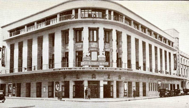
Van Graan introduced his breakdown of Cape Town’s Art Deco heritage by starting with what he calls “entertainment buildings”. He mentioned the former Plaza Cinema, which is located on the corner of what is today St George’s Mall and Waterkant Street.
“When you look at it from the outside, you can see it very much has elements of Art Deco,” he said.
“There is this kind of classical language; it has a central section with directed bays. There is curving and a distinctive corner, and then a sense of movement at the top.”
He continued: “When we look inside, in the foyer, we can see … Art Deco elements. It had gilded ceiling then stiff ceiling, playing into the idea of stiff forms. Then there was the decorative patterning on the walls, the Art Deco carpeting and decoration on the end of the columns.”
When it comes to commercial structures, Van Graan pointed to the work of Paarl-based architects Louw & Louw on the Santam building in the CBD. Situated on the corner of Wale and Burg streets, the building functioned as the headquarters of Santam Insurance and represented the emergence of Afrikaner culture into the commercial world.
“Prior to this, they were always seen as a farming community, but with the rise of Afrikaner nationalism, there was more engagement with and assimilation into the city.
“What’s interesting about this building, as the first of its kind in Cape Town, is that the language it adopted is Art Deco, as opposed to a modernist architecture.”
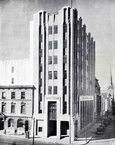
This was a surprising move from architect Wynand Louw, who was known for his signature Cape-Dutch style on the many buildings he completed in Paarl.
“Here, however, he expands into this American Art Deco tradition,” said Van Graan.
“My view on this is that he was avoiding anything that was vaguely British. And the idea is that this sort of vertical Art Deco that he was implying here was very much American. And, of course, we know the Americans won the [American] War of Independence, so they would set a good precedent as a language.”
The bar reliefs seen at the top of the building relate to farming activities and are another symbol representing the emergence of Afrikaner culture into industry.
Then there was renowned architect Herbert Baker, who represented the antithesis of what Art Deco stood for. Much like his older colleagues, Baker believed that modern architecture, both in terms of the modernist movement and Art Deco, should be rejected. This illustrates the barriers Art Deco was up against, as well as the barriers it was breaking down in the process.
Greenmarket Square is another location where Art Deco is prominent. However, in many of the residential buildings there is evidence of a mixed architectural language between an Edwardian Classical style and Art Deco elements.
“If you look at the projecting balconies, you’ll know those details are not classical, they are Art Deco. So the overall language is classical yet the details are Art Deco.”
Art Deco adaptations
Scottish-born architect WH Grant relocated to Cape Town in the late 1920s, where he adopted Art Deco after numerous transitional architectural phases. One of his most notable works is the Commercial Union building in Greenmarket Square. The building has ten storeys and is walled with travertine stone. Black marble skirting and golden tone mosaic form part of the interior.
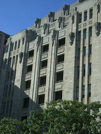
On the outside, however, there is a particular focus on verticality. Decorative elements, which draw on the patterns of the Aztecs and the Incas, are notable features of the Art Deco style. The elements, although eye-catching, are added high up on the building, forcing you to look up, creating a sense of height, significance and movement.
Interestingly, the Commercial Union building once again reinforced the notion of Art Deco populating the city through insurance buildings – a rather unexpected pairing. However, Van Graan theorised that while banks had to uphold a more conservative image, insurance companies were focused on growth and the future.
“We don’t insure the past or the present – we insure the future in an uncertain time. So the language it adopted was this modern, futuristic form. That’s one of the reasons why I believe insurance buildings so happily adopted Art Deco,” he said.
Lastly, Van Graan pointed out what he believes to be “the jewel of Art Deco in Cape Town” – the Old Mutual building. It is grand: The building has one of the longest granite friezes in the world, which stretches around three sides of the building. Designed by architects Louw & Louw, in association with Fred Glennie, the building was intended to be a regal and impressive space, and for many years was considered the tallest building in South Africa.
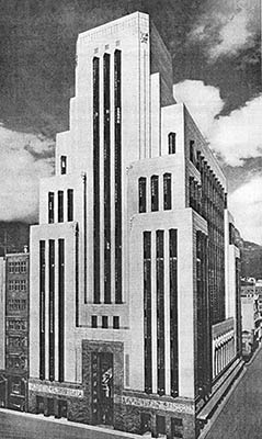
Glennie, who trained with Baker, was also an architect who came from an older, traditional background of arts and crafts, and yet he adopted modernism after he travelled to America and was exposed to Art Deco.
“There was absolutely no expense spared in terms of the granite on the façade and the decorative elements,” said Van Graan.
Bronze windows, pink marble and black granite all contribute to the monumental atmosphere of the space. In addition, the emphasis on verticality is what gives the building its rich feel.
End of an era
At the end of the 1930s, a breakdown of this movement began – the end of an era.
“The reclamation of the foreshore really marked the end of the Art Deco movement in the city,” Van Graan said.
A new foreshore meant a new, modern architectural language. Thus, the city did a full 180, going from a stolen Edwardian city at the end of the First World War to modernism and new architectural languages.
“So, the Art Deco we currently find left in the city relates to an earlier period – one which is an important component of Cape Town’s history.
“I believe it is critical that we not only understand, but also appreciate and preserve this architectural period.”
 This work is licensed under a Creative Commons Attribution-NoDerivatives 4.0 International License.
Please view the republishing articles page for more information.


